Whether you run a yoga studio, holistic therapy practice, or wellness retreat in New Zealand,
your visual identity communicates your values before a single word is spoken. This guide helps
you craft postcard designs that authentically represent your wellness brand.
Understanding Wellness Brand Identity
Wellness branding is about creating a visual language that speaks to calm, balance, and natural
harmony. Your postcards serve as tangible touchpoints that potential clients can hold, feel, and
connect with emotionally. Every design choice should reinforce the sense of peace and authenticity
your brand represents.
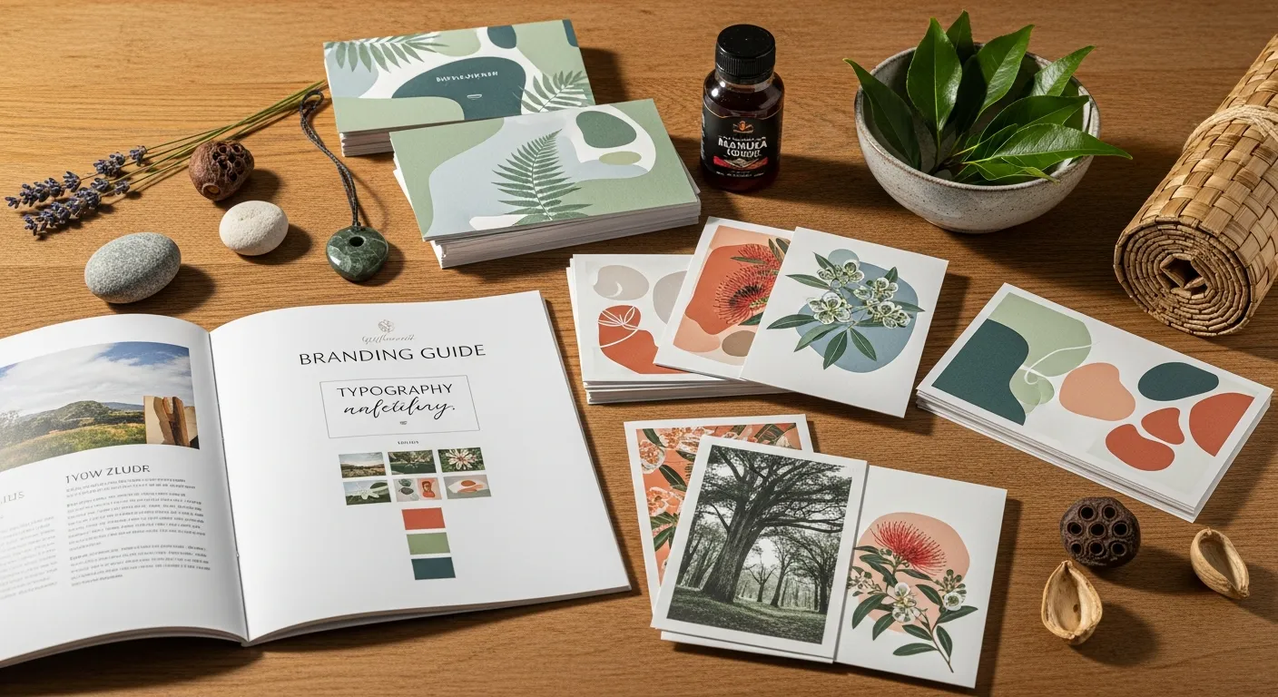
Color Psychology in Wellness
Soft, muted tones like sage green, warm sand, and gentle coral create feelings of calm and
safety. These colors reduce stress and invite recipients into a peaceful mindset, making
them perfect for wellness postcards.
Typography That Soothes
Choose fonts that feel approachable yet professional. Rounded sans-serifs combined with
elegant serifs create balance between modern accessibility and timeless wisdom, reflecting
your holistic approach.
Natural Textures and Elements
Incorporate subtle texture overlays reminiscent of handmade paper, linen, or natural fibers.
These tactile visual cues reinforce your connection to organic, authentic wellness
practices.
Key Elements of Effective Wellness Postcards
Successful wellness postcards balance visual appeal with clear communication. They should feel
inviting without being overwhelming, professional without feeling corporate, and personal without
losing clarity.
Whitespace and Breathing Room
Resist the urge to fill every space. Generous whitespace mirrors the mindfulness principles
your wellness brand teaches, giving visual elements room to breathe and messages space to
resonate.
Authentic Imagery
Feature real moments from your practice when possible. Show your space, your approach, and
the genuine atmosphere clients will experience. Authenticity builds trust far more
effectively than stock imagery.
Clear Call to Action
Guide recipients on their next step. Whether booking a session, visiting your website, or
attending an event, make the action clear, easy, and aligned with their wellness journey.
Tailoring Your Message for the NZ Wellness
Market
New Zealand wellness audiences value genuine connection, environmental consciousness, and local
community. Your postcard designs should reflect these values through thoughtful material choices,
local references, and messaging that honors the unique wellness culture here in Aotearoa.
Consider incorporating subtle references to native flora, coastal landscapes, or the natural beauty
that defines New Zealand. These visual cues create instant recognition and emotional connection with
local audiences while distinguishing your brand from generic wellness marketing.
Working With Sloxthit
At Sloxthit, we specialize in translating your wellness vision into compelling postcard
designs. Our process honors your unique brand identity while applying proven design principles that
resonate with wellness-conscious audiences. We collaborate closely with you to ensure every element
reflects your authentic voice and values.
Ready to create postcards that truly represent your wellness brand? Explore our custom design
services or contact us to discuss your vision. Together, we can craft visual touchpoints that invite
your ideal clients into the healing journey you offer.